

2025 Mizzou Basketball Creative Campaign Direction
Before the 2025 season, Mizzou Men’s Basketball unveiled their new uniforms. The uniforms were a nod to the historic look of the 1990s uniforms that are forever a fan favorite. The uniforms showcase the classic “Block M Missouri” logo on the front and a blocky Sans Serif font for the numbers with a thick offset stroke.
When I was asked to create the campaign for the upcoming season, I knew I wanted to pay homage to the new uniforms with a rich history, but still create something that showcases the modern, fast-paced brand of basketball that Coach Gates brings to the program.
Gameday Preview Graphics


For the gameday preview graphics, I wanted to highlight the “Block M” aspect of the uniforms. I did this by going with a black-and-white look. I kept the M gold to not only stay consistent with Mizzou branding, but also to create a point in the graphic that catches the eye and draws attention to the jersey.
For the look and feel of the design, I wanted to pay homage to the tenacious defense Coach Gates’ Tigers are known for. I accomplished this by creating a dark, storm-like design, using strong shadows and smoke, bringing a menacing feeling to the design.
Border War Campaign
The Border War is a rivalry between the University of Missouri and the University of Kansas’ athletic departments. The rivalry is one of the longest-lasting in sports, known for its intense hatred between the teams and fanbases.


For the gameday preview graphic, I created a scene at the iconic Francis Quadrangle on Mizzou’s Campus. Jesse Hall and its Columns sit in an overgrown jungle with Tigers hunting a Jayhawk. I chose to go outside the seasonal campaign for this game to play into “the war” between the teams and fanbases to highlight the importance, intensity, and tradition of the game.
I chose a simple — yet effective design for the final score graphic. It depicts a tiger sitting and looking at the audience with Jayhawk feathers at its feet. I wanted to create something that lets the fans decide what really happened by adding this intruging element to the design.
Retro Night Campaign
On Wednesday, February 19th, Mizzou Basketball hosted retro night vs Alabama. I was responsible for creating the social media campaign revolving around the night that included all of the typical gameday graphics and information that we put out throughout the day.
I wanted to pay homage to the 1980s Mizzou Men’s Basketball teams dubbed “The Cats From Ol’ Mizzou.” I drew inspiration from baseball cards from the 80s and chose to use a script font with grain and canvas textures to give the campaign an older feel. I also created tiger stripes in the same style of the script font for added design elements and Mizzou branding.


One Off - Stat Graphics
The one-off and stat graphics were an opportunity for me to get a little more creative. I mostly utilized darker backgrounds to contrast the lighter jerseys and cutouts to center the focal point on the player or statistic highlighted (and vise-versa). The 1000-point graphics are my favorite pieces I made in this campaign. I love the contrast and energy the tiger stripes and the sparks used in the background brought to the designs.


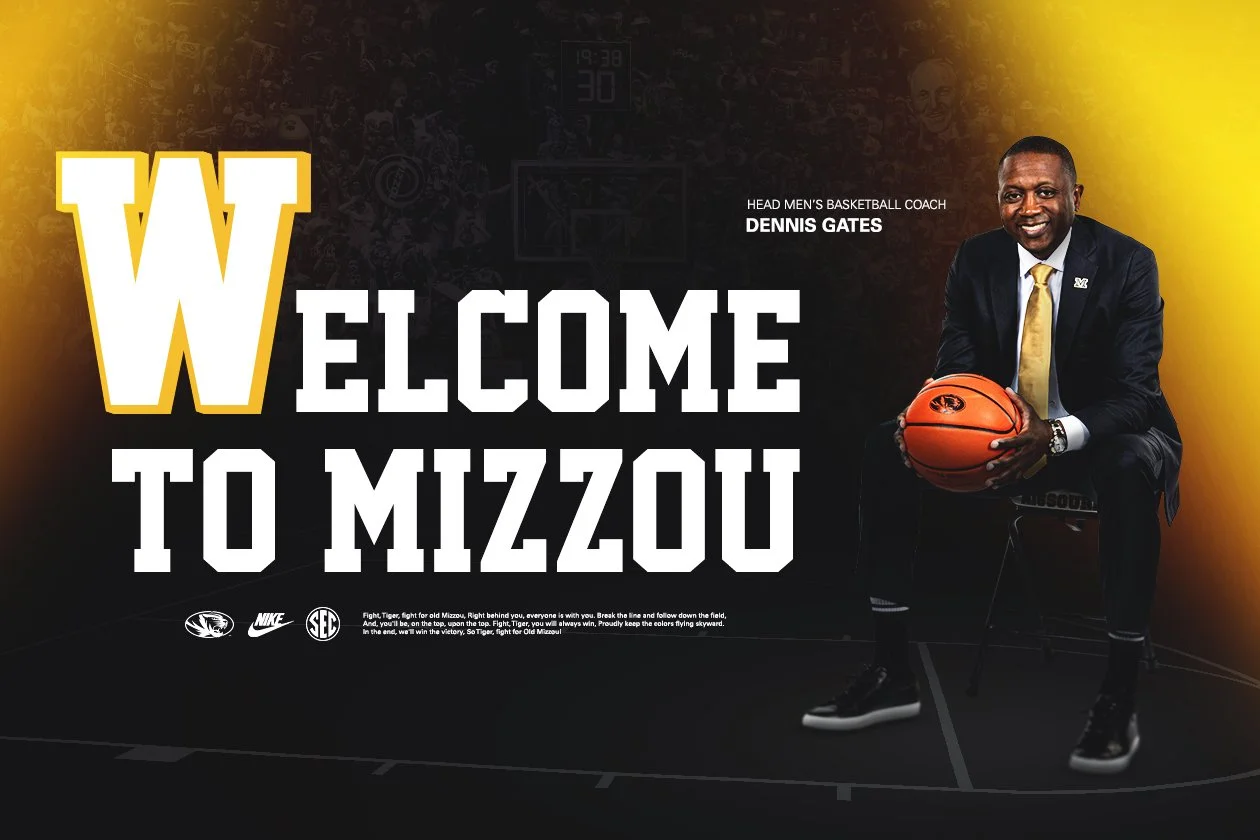
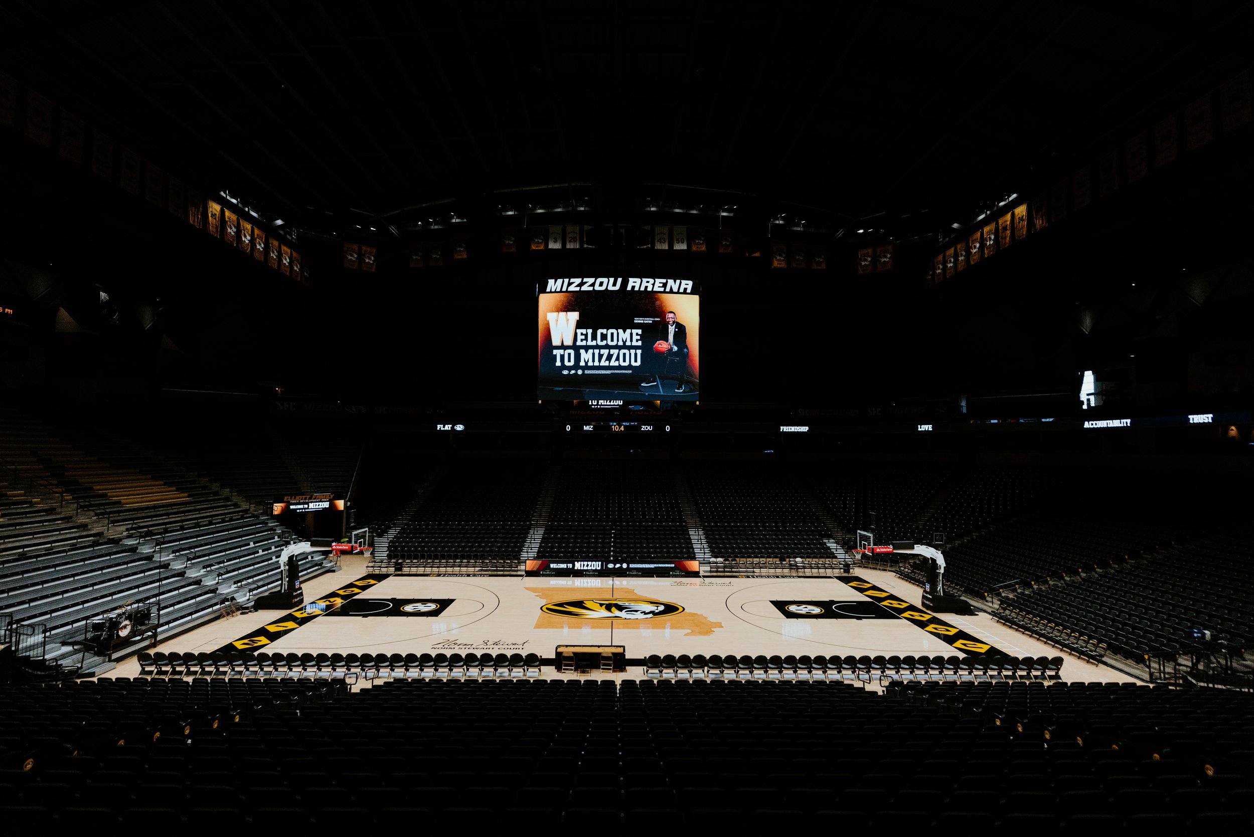
Video Board Graphics
I created video board graphics showcased to recruits on official visits and featured on the screen during practices. I chose to go with a darker look to match the darker vibe of Mizzou Arena, paired with a gold glow to stay within Mizzou Branding. I used the blocky font on the jerseys as my main typeface to symbolize the new era of Mizzou Basketball that I previously stated.

Marketing Graphics
For the marketing graphics, I chose to go a simple route to effectively communicate the information to our audience. This was another opportunity to showcase the throwback font on our jerseys creatively.


