

In my Strategic Design 2 class, we were asked to find a unique brand in a field dominated by major corporations and rebrand them. More specifically, in a way that makes them stand out compared to the giants.
I selected L.A.B. Golf. I chose them because of the new technology they bring to the golf and putter manufacturing world, along with their creative and out-of-the-box thinking in a field that is known for being pretentious and “old-school.”
I felt I could use their ideology to make a brand for the new generation of young golfers who love to defy the norms of the golf community.
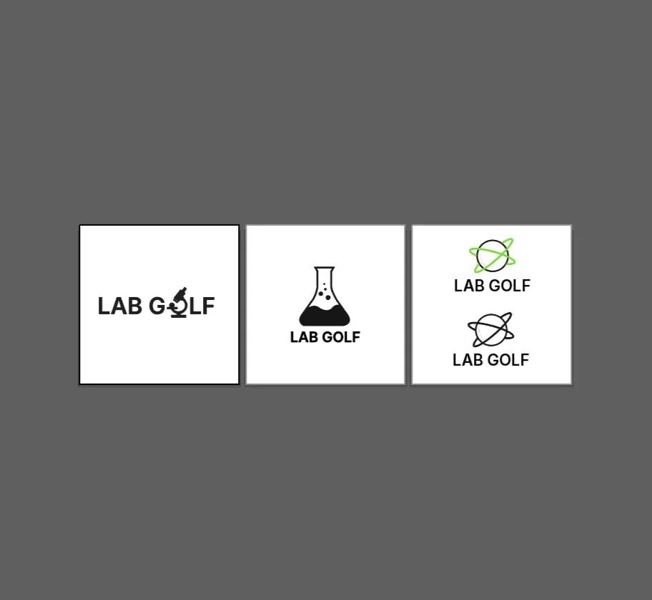
The Logo
When creating L.A.B. Golf’s logo, I honed in on their science-based approach to putter manufacturing. I wanted the audience to feel like these manufacturers were scientists looking at every detail down to the atom. Golf is a game where miss-hitting a ball even a millimeter can negatively impact your shot in a great way, so I wanted to symbolize this with their logo.
With this thought in mind, I chose to go with a modernized, clean typeface with a simple vector of a microscope that formulates the O in '“golf”. Scientists are very clean and organized with what they do, I wanted to capture and reflect on that.

The Process
-
![]()
Initial Sketches
-
![]()
Rough Drafts
-
![]()
Concepts
-
![]()
Final


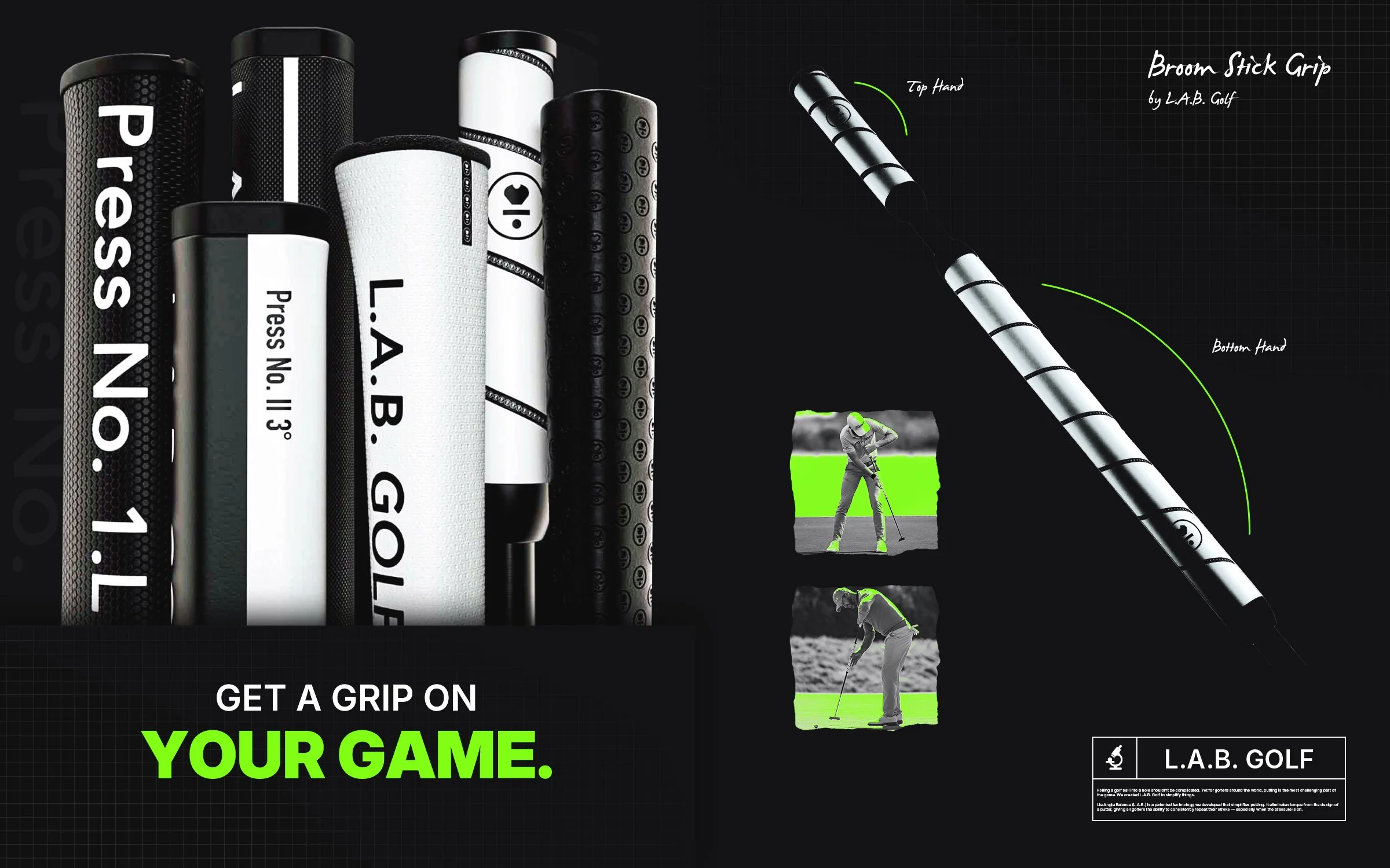
Sample Print Ads
I gave the sample print advertisements a look that reflects a scientist’s notebook or a blueprint. I chose a font that resembles handwriting and added type around the ads that resembled note-taking. I added a grid texture in the background not only to add depth but also to lean into the nod to notebooks.
In the corners of the ads, I created a logo lockup that resembles the periodic table, to further encapsulate the emphasis on science within the brand.
I incorporated a vibrant, neon green color to these advertisements to give them a modernized, fun feel to once again attract the young, flashy golfer target market.


Guerilla/OHH Marketing
For the Guerilla/OHH marketing, I chose a mock-up tour truck that can be seen at all PGA Tour events. All major golf brands send tour trucks to these events to not only have a space to have their golfers come and get their equipment repaired but also to market to all of the fans.
I decided to. create a sleek black-and-white look with a grid texture on the truck to capture the scientific look as a whole.
